
Continuing on the theme from the last post, I wanted to present a little compare-and-contrast assignment. We're looking at examples of poor choices for color management, balance, and overall composition in American animation. This is a problem especially for packaging of DVDs and movie posters. These are the worst offenders by far.
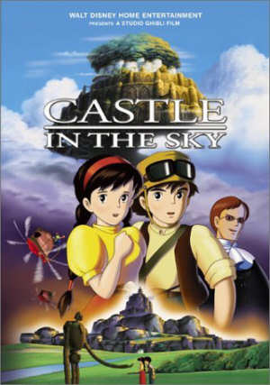
The first picture should come as no surprise to Studio Ghibli fans in America. It's the DVD illustration for Miyazaki's Castle in the Sky. Now, when this film was finally released, after sitting in Disney's vaults for four years, we weren't too critical of the design of the DVD. We were just happy to be able to watch the movie. Time, however, has not been nearly as kind, and in 2006 I doubt you'll find many dedicated Ghibli fans who aren't openly embarrassed by the cover design.
If you look closely, you can observe all our favorite pet peeves. Alright, MY pet peeves. Most of the standard offenses are in effect.
There are the over-saturated air-brushed characters, which seem to plague every single cartoon box in this country. I honestly don't know where this lousy notion was birthed, but it spread like the flu, and now we're stuck with it. I've never liked this style. It's just too, well, candy-like. My teeth hurt.
The composition is absolutely terrible. It's inexcusable that something like this ever left the desk of any credible art department. Don't blame them. Blame the marketing department. Remember what St. Pauline warned: there are definite consequences when conglomerates buy up the movie studios.
The concerns are about selling the product. Details from as much of the plot have to be crammed in, if there aren't enough cutesy animal characters to use. Observe how symmetrical the composition is at the center, with the characters in the middle, and the fortresses at top and bottom. The only thing, oddly enough, that is not perfectly centered is the robot at the bottom. In any case, this illustration is needlessly crowded. There is no real action and no real focus. Everything is shouting at you.
And, of course, everybody is smiling. Why does every animation illustration have to show everybody smiling? It's almost oppressive, in some warped 1950's Stepford Wives mindset. No, correct that; it IS oppressive. It almost looks like the main characters have had plastic surgery. They don't look like the characters from the movie at all, but one of those cheap knock-off cartoon videos that always piggyback on the latest Disney picture.

Now let's compare the Disney version of Castle in the Sky with the Japanese DVD. Notice a few differences? Which one would you prefer, kids?
Would it surprise you that Disney (under the Buena Vista label) is also responsible for the Ghibli DVDs in Japan? This little fact illuminates a lot about what corporate marketing dictates in this country, and what's accepted back in the home country. It should be said, of course, that Ghibli has far more say in how their DVDs are presented and compiled.
There's a far better artistic sense, a proper instinct for what works and what doesn't. The right folks are in charge. It helps that the studio, by the time they released their films on DVD, was already the most successful in Japan with Mononoke and Spirited Away. That level of success gives you a greater control over how you present your work.
This design was used for many of the Ghibli DVDs for a time, with one dominant color in the background, with the movie title on top and the illustration on bottom. This particular illustration isn't from the movie, but it perfectly captures its essence. You know what kind of a picture you're getting: an action-adventure cliffhanger serial.
This illustration comes from Ghibli's annual calendar, which they've been publishing every year since the late '90s. Each month features an illustration from one of the studio's films, beginning with Nausicaa and finishing with the most recent release. These drawings may depict a scene from the movie (or even scenes from the Nausicaa manga), or a variation on the movie, or a moment after the movie's conclusion.
Ghibli's illustration for Laputa: Castle in the Sky is one of my favorites from the Ghibli calendars (although I must admit that I've missed the last few calendars). Note how brilliant the composition fits everytyhing together; there are a greater number of objects than Disney's US "artwork," but the space is far more open. The third dimention is employed, and land, sea, and air are brought together.
This is an exciting drawing. It's full of action and movement; your mind moves through the action and delivers a sense of animation, a sense of time and motion. And angles, angles, angles everywhere. This is an area where the Japanese masters dominate, and this is one key reason why the best animation portrays a far greater sense of action, of motion, and of time than anything created by the Americans.
We're still stuck with those syrupy happy faces and boring 4/4 beats, when the Takahata's and Miyazaki's of the world have moved into modernism, abstraction, and jazz.
For those of us living in North America, this gives us a lot to thing about. We're going to have to start asking a lot of questions. And we're going to have to grab our credit cards and head over to our favorite import shops.
7 comments:
Personally, I think the Australian releases have the best covers in the entire world (better than the Japanese).
Take a look:
http://www.madman.com.au/studioghibli/
It's a shame how Disney are marketing these films, but, I'm just grateful that they are out on DVD at the very least.
Well, that's not that strange as most of the covers are slightly altered versions of the original Japanese movie posters...
Excellent topic, and one that I hadn't really spent much time thinking about but which has been a back-ground bother to me nonetheless. The packaging of the US releas of Castle in the Sky does in fact suck. Especially compared against the Japan release.
I feel like going over to the local Best Buy and doing a quick unscientific review of the anime covers there.
This is especially odd, because when Disney started to publish Ghibli movies in the UK (before they gave up, that is), the box art they used was almost exactly like the Japanese boxes. Now we have all the Ghibli DVD's done in more or less the same way as those Australian releases, only most of ours use just one set font. Oh well, it's the content on the disc that counts.
Couldn't help but see "Only Yesterday" gets released elsewhere but not in the US (where I'm stuck wtih a copy I taped of it off TCM last year).
This is interesting, and it also brings to mind why I've always preferred the actual movie poster to the DVD cover to most films (i.e. the original WALL-E immediately captures the loneliness of the poor robot's environment and story; the DVD cover makes it look like...a Disney movie).
I don't know what you're talking about. The Japanese DVD Cover is only HALF the cover, the rest consumed by NOTHING.
I can't really think of anything to complain about regarding the US DVD cover except for tiny nitpicking that doesn't make a difference.
Post a Comment