The most significant improvement with the new version is that it is optimised for 16X9 widescreen. The picture is slightly larger; I don' t know if you can tell from these photos I've taken. I watch on my computer with a 21" widescreen Gateway monitor, and the difference is notable. Let's take a look at some specific examples.


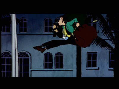
Our first example is from the movie's opening scene, where Lupin and Jigen rob a casino and make their escape. If I remember correctly, this sequence was used in a laserdisk videogame sometime in the early 1980's. I think I saw it once when I was a kid, but, like all laserdisk games, I could never figure out what the heck was going on. Too bad I was never shown the full movie back then.
Anyway, excuse the rambling. This first shot is from the new DVD; the second shot from the older release. The difference between the two is striking. The colors and contrast was clearly tampered with on the original DVD, enough so that it's difficult to properly make out details on most of the darker scenes. This was often a problem for early single-layer DVD's, and they've thankfully become a thing of the past.


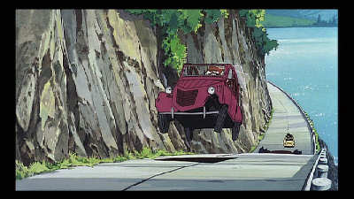
Our second example comes from the classic car chase. Here we can see the degree of clarity on the new release, the sharpness of the picture. It appears that the colors have been saturated a little on the older version, and blurred up somewhat. The higher contrast tends to flatten the image, dull out the light saturation. It's really not something you notice when watching the older version (which, to be perfectly fair, looks pretty good), but the crispness of the new DVD is immediately visible.


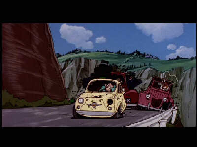
The third and final example is at the end of the car chase. It's a perfect example of the difference in color between the two versions. The older release bleeds extra color unnecesarily, and this makes the picture muddier, more "cartoonish." To be fair, this is the combination of the older DVD 1) using an older film print, and 2) being single-layer. The difference between that and today's dual-layer discs are striking - enough so that you have to be scratching your heads at the so-called "next generation" DVD format war. If that isn't a collosal scam to vaccuum more money our of your pockets, I don't know what is. Bush and Cheney would be proud.
Anyway, rambling again. Bear with me. The essential point I'm aiming to convey is that the new Cagliostro DVD looks far superior to the older Manga release. In, fact. I would say it's the definitive version, if not for one egregious, unforgivable error that left me furious. I'll discuss that in my next post; for now, I'm afraid I need some sleep.

1 comment:
For me, your second example is by far the most striking -- particularly the crispness of the details in the water, which now just jump right out at me.
I wonder if Netflix has the new DVD in stock yet. I originally rented the old version from them . . .and, of course, fell in love with it. I'm not sure why, but I always seem to forget this film a bit when I think of my all-time favorites; but then, once I'm reminded that it's absolutely a fantastic ride.
Chris
Post a Comment