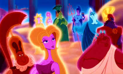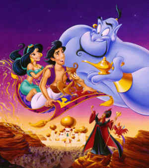
John K. wrote an interesting post on his blog about the garish color scheme that too often plague American cartoons, and the lack of color theory in general. I posted some comments earlier in the morning, and decided I should share them here:
If the color schemes of these cartoons are hideous and garish, there's a reason - these cartoons themselves are hideous and garish.
There's something just opressive about the way animation is illustrated on video and DVD boxes. The colors are oversaturated, with that syrupy gradiation. Everything looks like it's been pumped full of happy pills. It not only looks uninviting, it looks a little scary.
Perhaps that's just my thinking, and all that influence from reading Orwell. But I think the situation for animation in this country is somewhat oppressive, and is dictated more by corporatism and consolidation (isn't it nice when Disney owns everything?) than any true artistic sensibilities.
I wonder if artists and animators really understand the basics of color theory and composition and how to effectively use lighting and tone and texture. I think they're merely copying the accepted formula, a formula that is dictated purely by marketing. Bad Disney Video X sells, therefore everyone should copy it.
As Pauline Kael once noted, they think the grosses are proof that people are happy with what they're getting; that it's what they want, instead of what they're merely settling for. If we were given the freedom to present the public with actual choices, we'd see that play out.
I'm not sure how we'd change things, apart from re-educating every artist and animator that you work with. The medium has to stop being treated like the red-headed stepchild.


5 comments:
Hi, I enjoy your blog very much. Thanks a million for posting ann that video, I for one really appreciate it.
I am working as a colourist for several comic strips, and I have to fight the editor all the time over this exact issue! They want me to typical primary colours, never darker or lighter than your standard paint tubes. And the result is that they end up looking like every other comic on the shelf. So, I refuse!..
I do think that garish colours appeal to children. But I think that with a bit of skill and sensitivity, colours can engage them on an even deeper level. It all depend on the story you are telling, but I think if animated features look just like every cheap animated cartoon on Cartoon Network, we're in trouble.
Compare either of the pics you posted to just the poster of Spirited Away and your point is completely justified. You could probably do the same with almost every Disney Movie with almost every Ghibli Movie
I agree with just about everything in your post, except for one: we need to be re-educating the editors, not the artists or animators. Having known a lot of art school students, it's interesting to see how unique, skilled, and creative they are, up until the point they enter the corporate cartooning industry--because after that, it's often necessary to stop being original and to start being as skillful at copying the lead animator as you can, if you want to keep your job.
If it's any indication, the gaining popularity of other styles of animation over Disney is showing that, given a choice, audiences do prefer their colors less sickening. But it'll probably take a major financial disaster for the execs to wake up.
I sorta agree with the last guy's mention about the people in the industry who have a problem once they do get out of having learned animation and into the commercialized corporate world where things are dictated the way they are.
Hey Daniel, I love your blog. I'm glad I'm not the only one who noticed this. Its been really bothering me. Have you noticed that not only the covers of the Disney movies (and other USA animated films), but some of the film restorations of older films are plagued with oversaturated colors?
Also, the film industry in general seems obsessed with trying to make everything 'eye-candy' recently. Take for example this article, on the orange and teal trend:
I also wrote about something similar on my blog:
http://the-animatorium.blogspot.com/2013/01/the-issue-with-oversaturated-color.html
Post a Comment