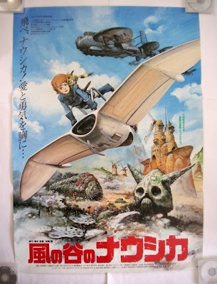
This is a rather unconventional movie poster for Nausicaa. The style is much more Western than Japanese; notice the heavy details on everything, the gritty "realistic" look of the piece. I happen to like this poster because of all these details; it reminds me more of Moebius than anything, and that happens to work for me, since Moebius was a major influence on Miyazaki when he created his Nausicaa manga.
This is a very impressive illustration, full of color and rich saturation. The "action" feels somewhat static and posed. It's clearly not something Hayao Miyazaki conceived. His action illustrations are the work of a master - the equal to Eisenstein, Kurosawa, and John Ford. All aspiring filmmakers should be studying his techiques and theories. Wouldn't that be so much better than stealing from video games or George Lucas? Sigh.

1 comment:
I don't really like this poster. It's a little too static and clean cut (none of the gloom and grim beauty from the film is in this one) for me. The details look fantastic, but the overall work lacks the spirit of the film. Obviously, there was no Studio Ghibli to produce the poster in-house as they do now, so the prospect of a poster like this being made is understandable, but not very effective.
Post a Comment