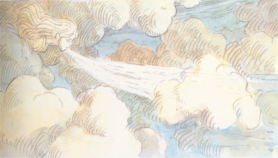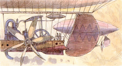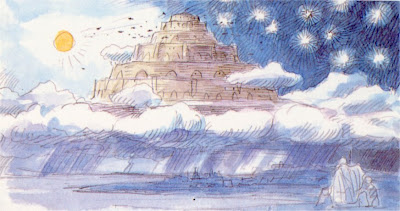


Here are a series of imageboard sketches created by Hayao Miyazaki for the title sequence on Laputa: Castle in the Sky. This is an especially inspired piece of filmmaking, so I'm glad to have the opportunity to examine it in closer detail.
Castle in the Sky is an interesting movie. Its roots lie in the cliffhanger adventure serials that Miyazaki loved to create in his youth, the zip bam bang fun of Animal Treasure Island, Lupin III, and Future Boy Conan. You could almost think of this film as Conan performed by the road company. But this is not the work of a young man, but a veteran artist at middle age. The wit and imagination is now joined by deeper, more serious contemplation. Issues of power and the tragedies of human nature abound, especially as the movie progresses towards its climax.
This title scene is wonderful. It's arguably my favorite of all the Studio Ghibli films, and it certainly matches Nausicaa for grandeur. Watching this, you are aware that you are seeing something truly special. The visual style is very similar to Miyazaki's manga drawing style, with the staccato drawing lines, heavy sepia tones, and densely packed picture frame. It doesn't look like stereotypical anime. It doesn't resemble anything from American animation, either. There's definitely a French influence, particularly Moebius, whose style greatly impacted Nausicaa. But Laputa is wholly original.
Joe Hisaishi's romantic sweep is so essential in this scene. Even now, looking at these imageboards, can you honestly say the movie's theme isn't playing in your head? C'mon, be honest. A gentle, romantic nostalgia pervades these drawings. It's as though Miyazaki harkens back to a lost era, a fabled golden age of aviation from another world. This is how life with the Wright Brothers should have been, if they grew up among Heidi's mountains and valleys.
Miyazaki's great love of airplanes has never been so vibrant. I can't think of anything before this point where his passion for flight took center stage. There were various aircraft seen on Future Boy Conan and Castle of Cagliostro and Sherlock Hound, but nothing on the scale of this. Porco Rosso may match it, though. But that film is heavier, weighted down by Miyazaki's struggle between youthful romanticism and midlife pessimism. Castle in the Sky sits alongside Nausicaa as the film director's great "doubt" statements, raising hard questions and providing few, if any, answers. And he struggles with that, without any sense of resolution.
I think that's why Nausicaa and Castle in the Sky are such great adventure movies. They are the works of an honest, personal filmmaker who isn't content to provide simple escapism. He needs to ask questions and seek answers. It's almost as though Miyazaki tells his stories solely for himself, and we just happen to be sitting nearby, listening.

3 comments:
thanks for those beautiful drawings. i have to admit that the opening sequence is my favourite bit of laputa. and is it terribly cheesy of me to admit that i'm rather fond of the souped-up music that hisaishi did for it in the english dub?
i love the whole idea of the opening sequence giving the historical or legendary back history, a as miyazaki had also done in nausicaua, and had been seen in toei's little prince and the eight-headed dragon too - though that may or may not be a significant reference point, i don't know.
Hmm, that's a good reference to Little Prince and the 8-Headed Dragon. Let me check that one out....
Okay, I watched the first few minutes of that movie (I downloaded it during the short time it was on YouTube), and I think you have a point. The title sequence is very similar to the style of Miyazaki films such as Nausicaa, Castle in the Sky, and Mononoke. There are a series of bronze sketches in the background, which may or may not be connected to the mythology in the movie. It's an interesting visual style, very different from the rest of the movie, and a nice show-off from the Toei artists.
That's a very keen eye you have. I hadn't thought of that before. I may just have to post some screenshots from 8-Headed Dragon one of these days.
I also forgot completely about the seperate score Hisaishi composed for the Disney DVD. I just hated the Disney dub so much for all its alterations and intrusion. His music as it originally stood was perfectly fine, and the moments of silence are crucial to Miyazaki's films.
The Disney dub followed the standard Hollywood thinking that movies should be VERY VERY LOUD ALL OF THE TIME!!!! This is the same logic that the music industry has used in pursuit of their Loudness Wars. It's just annoying, condescending, and more than a little rude. It certainly isn't something you do to another person's work.
This is why I couldn't come near the Disney DVD of Castle in the Sky. Ghibli's Japanese DVD is far superior in every way. But I've written about that on the blog in the past, and no need to repeat that all over again.
Thanks a lot for your comments. They're always greatly appreciated.
well thank you for a lovely, lively , interesting, and interestingly illustrated blog!
(and i hope you don't mind if i sometimes voice some of my crankier opinions too in your comments - i love ghibli's work too much to keep quiet about the things i don't like!)
Post a Comment